
Nov 25
Spring Wedding Colors and Combinations You’ll Adore
By Wedding Spot
Your color scheme is a crucial decision when planning a spring wedding — or any seasonal wedding, for that matter. The sooner you settle on your colors, the sooner you can coordinate everything from the bridesmaids’ dresses to the napkin rings.
But as you get started, you might wonder if your favorite color combos are a good fit for the season of renewal, warmer days, and fresh flower buds breaking through the soil. Or, you may have your heart set on one specific color, but have no clue which hues are a good match. Read on for our foolproof tips to help you find beautiful colors to brighten and highlight your spring wedding, no matter the venue you choose.
Start with the basics to find your spring wedding colors
Everything begins with the color wheel and basic color theory. When selecting colors for any event, complementary hues (opposites on the color wheel) are often used to create stunning contrast.
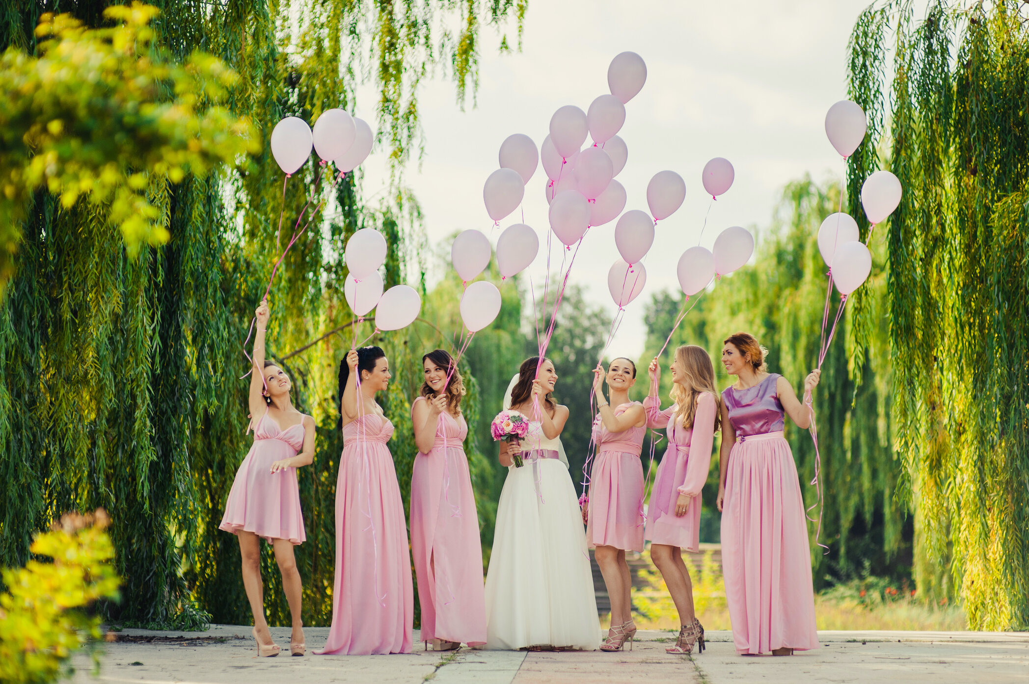
Complementary colors include blue and orange, red and green, or purple and yellow. But it’s often the varying tints and shades of these colors that top the wedding color list, such as pale turquoise and coral, sage and dusty rose, butter yellow and lilac. While many weddings once centered on a two-color theme, modern weddings start with complementary colors and expand to three or four for a striking effect.
Find the perfect venue for your spring wedding!
Get Started FreeChoose wedding colors that match your skin tone
No matter what your skin color, your skin tone is either warm, cool, or neutral. Before you choose a wedding color scheme, think about how the colors affect your skin tone and which are most flattering. The wrong color can wash you out, making you look tired or ill. The right color can make you look even more stunning (if that’s possible).
Tips to help you find your skin tone:
-
Look at the veins in your wrist. If they appear to look blue, your skin tone is cool. If they appear green, your tone is warm. If it’s difficult to determine, your skin tone is neutral.
-
Check out your jewelry collection. Do you look best in silver? Chances are you have a cool tone. If gold is more flattering, your tone is warm.
-
Consider your reaction to the sun. If you burn easily and tan rarely, your skin tone is probably cool. If you tan easily and rarely burn, you likely have a warm tone. Neutral skin tones can fall into either group.
Colors that complement each skin tone:
-
Cool. Your most flattering colors are on the cool end of the color spectrum. This includes blue, lavender, rose, pink, and grey. If you prefer warm colors, go with pale yellow, rose red, and rich ruby. Avoid orange, bright yellows, and tomato red, which will clash with your tone.
-
Warm. Your flattering colors are on the warm end of the color spectrum. This includes peach, olive, gold, coral, and cream. If you prefer cool colors, choose orchid, moss, or violet-red. Avoid icy and jewel tones as they can make you look ashy and washed out.
-
Neutral. You’re in luck if you fall in the middle or outside of the ‘cool’ and ‘warm’ categories. That means you have a ‘neutral’ skin tone, which is flattered by most colors. True red, blue lagoon, and jade green are perfect for you. Just avoid colors that are too bright, such as fuschia or cyan, as they can overwhelm your complexion.
Explore some of our favorite spring wedding color schemes and themes:
Springtime is a time of renewal and growth. Take advantage of the blooming flowers, young leaves on the trees, and blue skies for the perfect wedding photo backdrop. The spring season delivers lovely shades of green, from moss to mint to emerald, so capitalize on their glorious beauty by mixing:
-
Emerald, ivory, and gold
-
Kelley green, deep orange, and yellow
-
Varying shades of green and blush
-
Moss, ivory, and coral
-
Mint, peach, and gold
-
Lime green and lemon yellow
-
Seafoam green and salmon
If you’re not keen on shades of green, there are plenty of colors that are just as beautiful and evoke the freshness of spring, including:
-
Ice blue, barely-there pink, and stark white
-
Peach, cream, and pale yellow
-
Dusty rose, white, and dove grey
-
Pale pink, cream, and silver
-
Royal blue, pale blue, and ivory
-
Rose gold, blush, and cream
-
Lavender and champagne
Need help putting together your palette? Use a color tool to help you decide which colors will work best together. Simply pick your main shade from the color wheel and receive the colors that work best together to create a stunning effect.
Discover 6 color schemes that are smoldering for spring 2020
Looking to be a trendsetter for your spring 2020 wedding? Here are some lovely emerging schemes:
1. Neutral garden colors.
Pair together ivory, champagne, beige, and sage green to create a spring garden effect.
2. Delicate and pretty.
Lilac, lavender, and light pink. These shades are perfect for the spring as they can be found in full bloom just about anywhere.
3. Warm and cool balance.
Terracotta, teal, sand, and foggy blue. A balance of warm and cool tones keep this hot-for-2020 color scheme mellow and complementary to any style.
4. Trendy and daring.
Fuschia, blush, and green. Dare to try this 2020 trend that brings a burst of color and elevates the already upbeat atmosphere.
5. Earthy and organic.
Willow green, dove grey, latte, white, and lavender. This is a timeless palette that will always trend for spring weddings.
6. Colors of the sea.
Shades of sea green, sage green, ivory, and grey. Use the colors of the surf to create tranquility and romance.
Explore 6 unique spring wedding color combos
Though classic and pretty, pastels are not a must. Have a deeper color that you love? Use this bold color for subtle design highlights (bouquets, napkins), and pair it with a lighter complementary color on more prominent elements (bridesmaid dresses, tablecloths). Browse through a few color palettes to discover what works best with your favorite hue.
1. Red and pale aqua.
If your favorite color is red, you can still use it for a spring wedding by pairing it with aqua to create a calming cool.
2. Burgundy and yellow.
Burgundy is a classic fall wedding color. But mixed with yellow, this regal color gets an upbeat makeover that works beautifully in the spring.
3. Navy, coral, and gold.
Navy is always a classy color, but when you combine it with gold and coral, it takes on a striking springtime elegance.
4. Black, white, and pale green.
You might not believe that black can look beautiful for a wedding, but pairing it with white and pale green creates a formal look that’s just right for the season.
5. Poppy, celadon, and white.
This combination creates a beachy feel, no matter how landlocked you are. It’s fresh, clean, and entirely outside of the box.
6. Eggplant, lilac, and cream.
Offset beautiful contrasting shades of purple with the lightness of cream.
Here are 6 mistakes to avoid when picking your wedding colors
There are some spring color faux pas to navigate. Make sure your color choices are as right as spring rain, by avoiding these common mistakes:
1. Selecting wedding colors that don’t fit your personality.
That fuschia color scheme might be a hot option for 2020, but if you’re more of a pastel pink kind of girl, buck the trend and stick with what feels like you.
2. Using too many colors.
You don’t need to limit yourself to two colors, but going with more than four can be overwhelming. Three is ideal, but you can go up to five with a neutral color in the mix. Your colors should pull your decorations together for a streamlined look, not a messy one.
3. Picking colors that clash.
Stick with the color wheel and find colors that complement each other or are varied shades in the same family. For example, shades of purple with a few complimentary neutrals
4. Not matching the venue.
If your venue already has a prominent color scheme (e.g., The Rose Room, The Emerald Hall), factor this in to avoid the dreaded clash listed above. That lime green and lemon yellow theme won’t look quite right if the decor is adorned with mauve curtains you can’t remove.
5. Ignoring textures.
Whether it’s your home or your reception hall, patterns and texture make an impact. Use them to create depth, but be sure they complement each other. For example, if you choose rustic, burlap table runners, choose cotton tablecloths over satin. Patterns like stripes and florals can add depth and balance, but pair small, busy patterns with large, simple ones to avoid looking busy and overdone.
6. Playing it too safe .
Don’t limit yourself to the two-color rule. Even if you’re absolutely determined to use cornflower blue and butter yellow, you can incorporate chartreuse and navy to add depth. And you don’t always have to stick to the standards. Wedding colors can include brights, metallics, and even black.
Now you’re an expert on spring wedding colors!
Up next, learn how to incorporate them into your wedding. Have a date that’s closer to summer? Find the best color schemes for your summer wedding. Winter? Here are 25 incredible winter wonderland wedding ideas
Find the perfect venue near you!


Wedding Spot
The Wedding Spot blog is designed to help couples navigate every step of the wedding planning journey. From before the engagement to after you say “I do,” our goal is to give you the tips, ideas, and inspiration to prepare for your big day — and all that comes with it.